

Our lives today revolve around gadgets and that’s why this era is called the digital era. Desktops, Laptops, Mobile phones, tablets, pads, notebooks, netbooks, phablets, etc are the different versions of systems we use to access the internet and also use for keeping records and data of our personal and professional lives. The idea of
Our lives today revolve around gadgets and that’s why this era is called the digital era. Desktops, Laptops, Mobile phones, tablets, pads, notebooks, netbooks, phablets, etc are the different versions of systems we use to access the internet and also use for keeping records and data of our personal and professional lives. The idea of a life without a mobile phone or a computer or the internet seems crippling.
Gadgets we use have become a necessity and no more a luxury especially for people in the profession requiring their usage. What has been surprising is the pace at which mobile internet usage has come to vogue and replaced computers for the purpose of web browsing specifically.
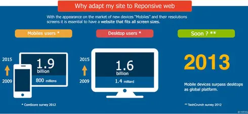
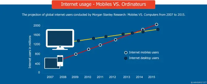
Morgan Stanley reports depict that in the year 2014 mobile internet usage will stand shoulder to shoulder with laptop or desktop internet usage and it won’t be a big deal because a quarter of the population already prefers to go online using their mobile phone.
Another relevant surprising fact is that the online sellers are still not waking up looking at these facts and are not designing their websites that are compatible with all forms of devices.
You are suffering because customers are looking for you online through their mobile phones and you are not available for them. Customers make a switch in such cases to the next best alternative available.
Customers do not always end up buying a product, but they become prospective buyers as well. This issue is tackled with the help of accommodating a responsive web design to your websites.
Having a responsive web design is the one step solution to all these problems. Not having it you are losing great opportunities for business development as well as revenue generation. Let’s understand the term in a broader manner.
Definition of Responsive web design
“RWD or Responsive web design is an approach that enables the websites to avail the optimal experience of viewing them by the users. It does so by facilitating reading and browsing the website by minimal number of clicks and modification of size.
It’s available on a large number of devices including mobile phones, computers, tablets, etc. “Responsive web design is a term coined by Ethan Marcotte and he describes it as a number of ideas combined together to be formed as responsive designs.
He further describes responsive technology as the multiple numbers of techniques combined together to come out as a design. The relevance lies more in understanding what purpose does a responsive web design serves.
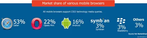
Even a person possessing a basic mobile phone and internet knowledge understands that it has an inbuilt web browser as well as supports multiple web browsers that can be downloaded.
Idea incepted by Apple of putting the browser in a phone has been followed by all the mobile platforms and the concept of smartphones doesn’t just define its ability to play music and click pictures anymore.
Smartphones today serve the purpose of web browsing in a big way. As a matter of fact, they are preferred over laptops or desktops to go online by a majority. The bottom line is mobile phones are nothing that they were when the mobile revolution initiated.
They are pocket PC’s and mobile web is a totally another platform that has emerged and online businesses are supposed to keep up with it if they desire to succeed. Responsive web design to be exact solves this purpose.
The famous Mobile versions of Websites
 Businessmen that are aware and understand the changing face of mobile technology must also understand that scenarios change rapidly in the digital world and they have to keep up with them.
With the presence of a web browser on a mobile phone, a person wishes to surf the net or do online shopping as easy as they do it using their computers.
This led to the emergence of mobile versions of websites along with the desktop version. It made sense and came out as a reflex action by the web designers.
But technology is changing every single day and with the continuing technological revolution, brilliant inventions like tablets, touch screen phones, and mini laptops- notebooks and netbooks and the latest one’s called ultrabooks came in vogue.
So the version that was designed for mobile phone’s small screens became dormant for these big screen devices.
Web designers came back to action and crafted separate versions for these. But inventions and technological advances will keep on happening every coming day and resolution and sizes will keep on changing, having separate versions for every next device is not feasible or practical which paved way for the responsive website design.
Do not confuse the Mobile version with the Responsive web design
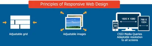
Responsive web design is not one single specific technique or concept. It actually is a kaleidoscope of multiple techniques and it must not be confused with the mobile version of a website. Let’s understand the difference between the two.
The mobile version of websites is a narrower term than Responsive web design. Responsive web design is a very intelligent mechanism that transforms a website into different screen sizes and resolutions.
It’s done by coding and works on different devices, unlike the mobile template which is a totally different platform and it requires the businesses to formulate a separate website or a subdomain in totality to be supported on a specific class of mobile phones.
Responsive web design is the most popular and most preferred solution for developing a mobile website till date.
Why responsive websites are important
If you are looking for one reason to incorporate Responsive web design I will give you many:
1. Mobile phones are not just gadgets any more they have become a part of life:
It was shocking for me that businesses are still not having their dedicated mobile websites even after coming across the facts I am about to share with you. Change in the mindset can be estimated by these fun facts that on our planet there more mobile phones than television sets and 91% of the US population keeps their mobile phone at an arms distance twenty-four seven. Let’s have a look at the facts reflecting the preference of people towards mobile phones over other devices.
- Almost a quarter of Google searches are made using Mobile phones across the globe.
- In the year 2012 in terms of local searches conducted, more than 50% of them were made using mobile phones.
- Almost a quarter of a population of United States of America uses mobile phones only to browse the internet.
- There are preferences in terms of brands providing better mobile experience too. 61% of people said they prefer the brand that provides a better mobile experience than the one that doesn’t.
- The mobile email box is also very popular. 26% of people use mobile phones to check their mails and around 11% check them on tablets.
I will call it sheer stupidity if despite knowing such eye-opening facts you as a businessman still do not plan on getting Responsive web design incorporated, because if you are not, you are choosing to miss out tremendous opportunities.
2. Impact of a responsive website on ranking: Google’s think insights reflects some eye-opening data related to the importance of having a user responsive mobile website.
- If a user is not satisfied with the results of the mobile website of a company and finds it confusing or difficult to handle there is a high probability that 61% of them will leave it and switch to a competitors website.
- The responsiveness of web design also stands in favor of you. If the user likes the mobile website of business the probability is as high as 67% in terms of buying a product or getting service from you.
- This clearly indicates benefits apart from business development and revenue generation. If you are a consumer’s preferred website, you definitely are Google’s preferred website and your rankings will definitely go up.
3. Social Media and blogging as strategies are incomplete without Responsive website design: The most famous and well trusted inbound marketing strategies are blogging and use of social media. They are really effective in generating traffic and it’s interesting to know that they attract a lot of mobile visitors. Around 55% of social media access takes place on mobile phones. That’s a big share. When content and links are shared to your business website and you don’t have a responsive website you will have to face the following consequences:
- A very high bounce rate because your audience will get lost
- You will have a low conversion rate because you are not there for your prospective customers who are looking for your presence through their mobile phones.
- A frustrated audience which will not only switch from your brand to another but will promote negative word of mouth about you.
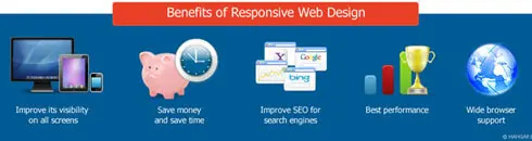
4. SEO advantages of responsive website design: A responsive web design is preferred in terms of SEO. It’s not my opinion but Google’s. In the year 2012 in the month of June, it was declared publicly by Pierre Farr that Google prefers the responsive web design over mobile templates, the reason being it’s easy for Google to scan your website completely if it has a responsive website design. Why? A unique single URL facilitates Google to scan a website and Google’s external algorithm easily thereby eliminating the probability of making the on-page SEO errors. This gives responsive websites an added SEO advantage. They not only are better in terms of performance but also are easy to maintain than a separate mobile template website.
5. Responsive websites are fast and the faster it is, the better it is: It is obvious when a web page is opened on a mobile phone it takes less time to load because of its resolution and size. Google page speed developers state that it takes less than 1 second for above the fold content to load on mobile websites and the complete page gets loaded within 2 seconds. This speed is not possible to come along on the desktop version of a website. Responsive website design makes it very fast and users prefer it fast. When it takes too long for a page to load they leave it at once and switch it with a faster alternative. Google has this amazing tool that helps you evaluate the speed of your website, check it and make constant efforts so that you do not lag behind.
6. Responsive websites are adaptable to all devices: This is the feature that makes a website compatible for all the devices and responsive web design, most liked web design features to date. Screen size is not a bar for a visitor is viewing your website if it is responsive. Be it a five-inch screen or a 42-inch screen the resolution, features, and colors will come out beautifully and brilliantly. It’s a step ahead than what has been happening till now and every business must adapt to responsive website design not just for the sake of competition but for making things easy for business.
It is very crucial that your business website provides its users an experience that’s quick, responsive, easy and most importantly available to them on the devices they wish to have it on because it’s the era of post mobile revolution. If you are thinking that you are doing something brilliant by having a mobile website of yours, you are living in an illusion.
It’s not a great feature but need of the hour. It’s a necessity for your business because the world has moved ahead of computer web browsers and mobile templates. People don’t like to wait and they are aware of the changes around them. Responsive website design is a solution to a number of problems not just SEO related, but also your revenue and conversions related.
Technology is becoming dormant every single day. Stay updated and follow its league because your stakeholders are doing it already. I hope this blog has helped in getting answers to your queries satisfactorily. Keep working hard. Cheers !!!
1) Top 5 Reasons Why Every Business Should Blog with Infographic
2) Top 5 Ways to Generate More Leads Through LinkedIn ( With Info graphics)
3) How to Use Pinterest for Business
4) How to Start an Online Business
5) The Ultimate guide on Getting Traffic to e-Commerce Websites
6) How to do SEO in 2014 KEEPING GOOGLE Humming Bird Update in Mind
7) Top Online Marketing Trends in 2014
8) Ultimate Guide to Fixing Google Penalty9) The Ultimate Guide to Protect Your brand from Negative Reviews or to Get Rid of It